Template
Sandstone - a warm beige link in bio template
Sandstone is a warm, neutral light-mode template built on a sandy beige background with cream cards and espresso-brown text, giving your page the calm, organic feel of natural linen and unbleached paper.
The palette
Colors in this template
Background
Cards
Accent
Borders
Text
Subtext
Muted
Why Linky
Why creators choose Linky
- Custom domains
- Connect your own domain on a paid plan to make your page feel truly yours.
- Beautiful themes
- Make it yours with custom colours, fonts, and a palette that matches your brand.
- Rich blocks
- Music, video, social feeds, and more - not just links. Your page stays fresh automatically.
- Analytics
- See views and clicks on your blocks and links with built-in analytics on Premium.
- Fast & simple
- Build your page in minutes with a drag-and-drop editor. No coding required.
- Verified pages
- Get a verified badge on your page to show your audience that it is the real you.
01
Warm neutrals, naturally calm
Sandstone works in the hue 28-38 range - the territory of sand, oat, and unbleached linen. The page base sits at 90 % lightness with gentle 35 % saturation, while link cards rise to a creamy 96 % lightness. A soft sand border at 80 % lightness keeps card edges visible but quiet. Espresso-brown primary text at 16 % lightness anchors the palette, with a lighter taupe secondary label stepping back for supporting copy.
Your theme, your colours

A real Linky page
02
What's included in the Sandstone palette
The seven colour roles cover a sandy beige base, a cream primary card, a light-grey secondary surface for avatar placeholders, a warm sand border, an espresso primary label, a taupe secondary label at 32 % lightness, and a near-white tertiary label. Unlike a plain grey neutral theme, every tone here carries a warm undertone, which makes photography - especially skin tones, food, and natural materials - look richer against it.
03
Who Sandstone is best for
Sandstone suits creators with an organic, earthy aesthetic: interior designers, ceramicists, slow-fashion brands, coffee shops, bakers, photographers, and wellness practitioners. It is also the go-to for the minimalist-but-warm Instagram aesthetic - if your grid leans into beiges, browns, and natural light, Sandstone extends that feel to your link page without any customisation.
Playing Now
ten
Fred again
Live blocks that refresh automatically
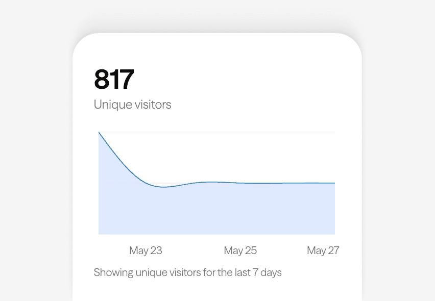
Built-in analytics on every page
04
Adjusting Sandstone in the editor
Load Sandstone in the Linky editor and you can push the palette in several directions while keeping its calm character. Nudging the base hue towards 45-50 produces a yellower wheat tone; moving towards 20 gives a pinker, terracotta-adjacent sand. Reducing saturation across the board lands you in greige territory for a more architectural look. The espresso labels can also be warmed towards chestnut or cooled towards charcoal.
Gallery
More templates
Classic
Violet
Midnight
Forest
Lilac
Orange Punch
Ocean
Blush
Slate
Neon
Mocha
Sunbeam
Cherry
Sage
Sky
Lagoon
Mulberry
Peach
Graphite
Vapor
Paper
Frequently asked questions
Everything you need to know to get started.
Free forever
Your page is one username away
Claim your link in bio and have it live in minutes - free, no credit card.
No credit card · Connect a custom domain anytime · Cancel whenever