Template
Mulberry - a burgundy link in bio template
Mulberry is a wine-dark template with layered burgundy backgrounds, white headline text, and a dusty rose secondary label - rich, literary, and quietly luxurious.
The palette
Colors in this template
Background
Cards
Accent
Borders
Text
Subtext
Muted
Why Linky
Why creators choose Linky
- Custom domains
- Connect your own domain on a paid plan to make your page feel truly yours.
- Beautiful themes
- Make it yours with custom colours, fonts, and a palette that matches your brand.
- Rich blocks
- Music, video, social feeds, and more - not just links. Your page stays fresh automatically.
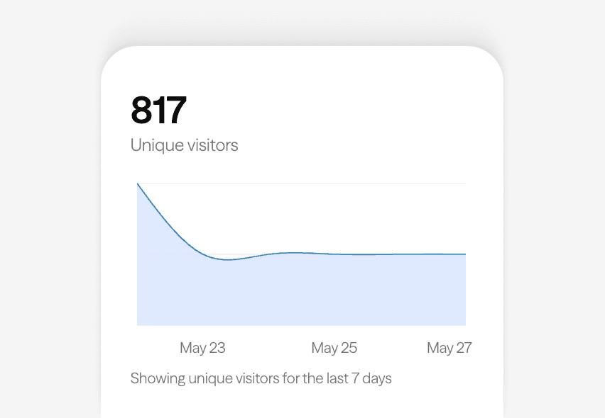
- Analytics
- See views and clicks on your blocks and links with built-in analytics on Premium.
- Fast & simple
- Build your page in minutes with a drag-and-drop editor. No coding required.
- Verified pages
- Get a verified badge on your page to show your audience that it is the real you.
01
Wine-dark and warm
Mulberry is built on hue 340 - the boundary where red deepens into wine - at low lightness and moderate saturation. The page base sits at 17 % lightness, the colour of a good Malbec, and link cards drop to 12 % for a layered, velvet depth. A muted burgundy border at 27 % lightness keeps card edges defined without breaking the mood. White primary labels and a dusty rose secondary label complete a palette that feels like a private members’ club.
Your theme, your colours

A real Linky page
02
What's in the Mulberry palette
Seven colour roles: two layers of deep burgundy (base and primary card), a light-grey secondary surface for avatar placeholders, a desaturated wine border, a pure-white primary label, a dusty rose secondary label at 80 % lightness that softens supporting copy, and a near-white tertiary label. Compared with Cherry’s assertive red, Mulberry is cooler, deeper, and more reserved - claret rather than crimson.
03
Who Mulberry is best for
Mulberry suits brands trading on richness and refinement: wine bars and sommeliers, bookshops and authors, jazz musicians, vintage fashion sellers, luxury candles and fragrance brands, and academia-adjacent creators. The dark-academia and quiet-luxury aesthetics both live comfortably here. If your brand would rather be described as cultivated than loud, Mulberry sets that tone instantly.

Playing Now
ten
Fred again
Live blocks that refresh automatically
Built-in analytics on every page
04
Decanting Mulberry in the editor
Open Mulberry in the Linky editor and adjust the vintage. Shifting the hue towards 350-355 warms it towards a redder claret; towards 325 cools it into plum and aubergine territory. Raising the saturation deepens the jewel-tone richness, while lowering it produces a faded, antique rose-brown. The dusty rose secondary label can be brightened for more contrast or muted further for an even quieter page.
Gallery
More templates
Classic
Violet
Midnight
Forest
Lilac
Orange Punch
Ocean
Blush
Sandstone
Slate
Neon
Mocha
Sunbeam
Cherry
Sage
Sky
Lagoon
Peach
Graphite
Vapor
Paper
Frequently asked questions
Everything you need to know to get started.
Free forever
Your page is one username away
Claim your link in bio and have it live in minutes - free, no credit card.
No credit card · Connect a custom domain anytime · Cancel whenever