Blog4 min read
The link-in-bio stack every visual creator should try in 2025
The tools visual creators can put behind one bio link: visual previews, analytics, booking and more.

Hana
When a portfolio isn't enough anymore
Being a graphic designer in 2025 can feel like doing eight jobs at once. You're expected to create, promote, engage and pitch, and keep a consistent look across ten platforms while you're at it. Your work lives on Behance, Instagram, maybe YouTube. Your shop is on Gumroad. Your calendar is probably buried in a Notion doc or a Calendly link somewhere.
A static online portfolio still matters, but it can't carry all of that on its own anymore.
This is where a link-in-bio stack helps. It's a single page that ties everything together and keeps up with what you're doing, without clashing with your aesthetic. Here's what that stack should include.
1. Pick a visual-first link-in-bio tool
Don't settle for an ugly page. If your link in bio looks like a robot designed it in 2013, that reflects on you.
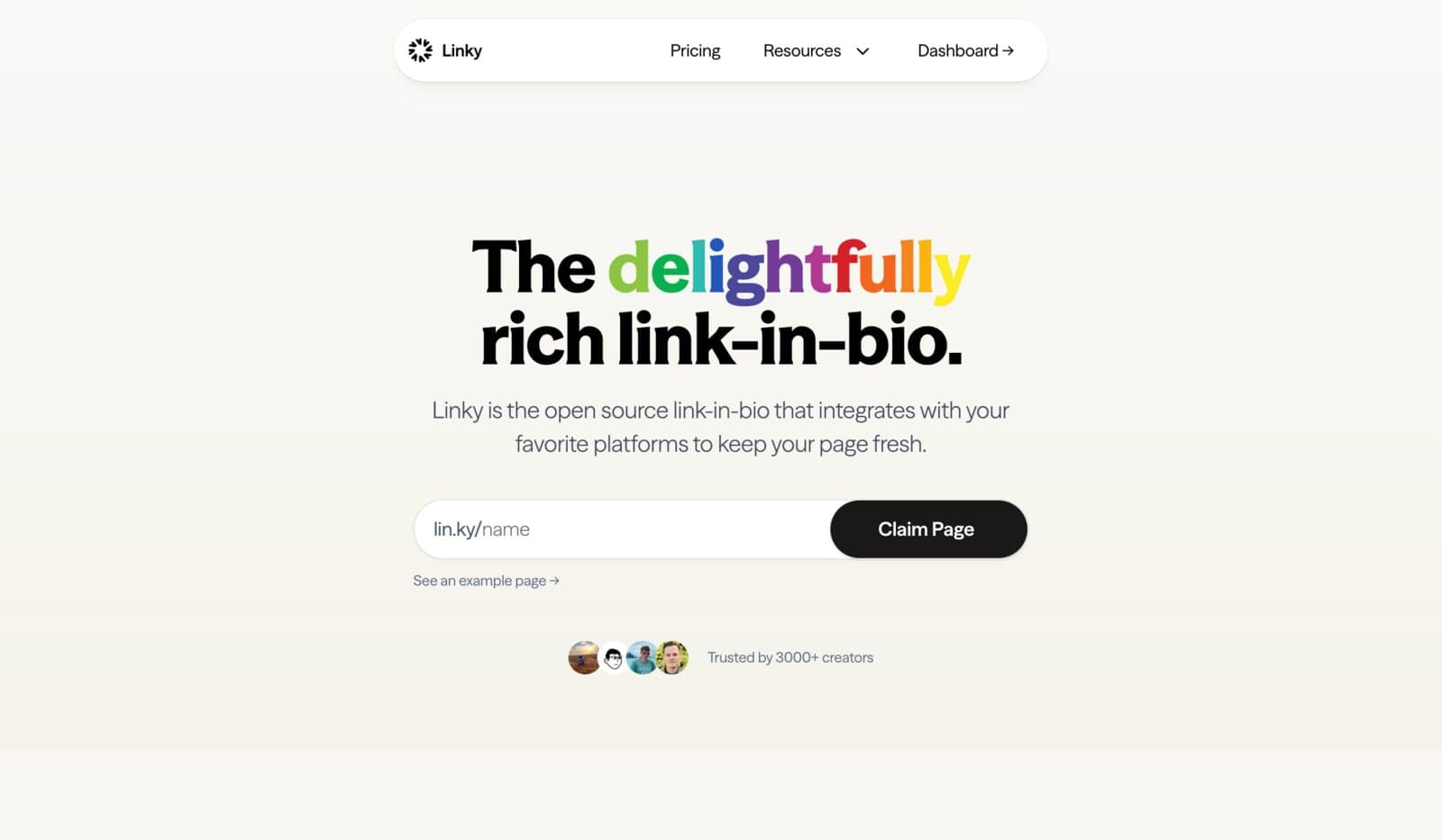
Linky is built for creators who care about visual details. You get:
- Custom themes with full control over typography, including variable fonts
- Subtle transitions and hover animations
- Gradient backgrounds that don't look like a template
- Responsive layouts that work well on both mobile and desktop
The result is a link page that feels like part of your brand rather than a third-party widget attached to your bio.
If you want help making it your own, this guide walks through it:
How to Customize Your Link-in-Bio Page
2. Show your work before the click
People are scrolling, not digging. If someone lands on your link in bio and all they see is "Behance →" or "Portfolio →", you've probably lost them.
Put visual previews on the page instead, such as:
- A few hand-picked Figma frames
- Recent Dribbble shots
- Screenshots from a case study
- A short reel, if you work in motion
Some tools, Linky included, let you create visual link blocks or preview carousels that put your work up front. Visitors see what you do straight away, without an extra click or any guesswork. Think of it as showing the trailer before asking someone to watch the whole film.
3. Let people book, tip and message you, not just click
Graphic designers often work as freelancers, art directors, workshop hosts and product creators, sometimes all at once. Your link page should help with all of that.
A simple setup for 2025:
- One link to your calendar (Calendly or SavvyCal)
- One to your shop (Gumroad, Ko-fi, Lemon Squeezy, etc.)
- One for quick client contact (a DM via Instagram, WhatsApp or Telegram)
- Optionally, a Notion intake form for new projects
The aim is to remove friction. If someone already likes your work, make it very easy for them to get in touch or buy something.
Write link labels in a friendly, action-oriented way, like "Book a design consult" or "Grab my icon pack," instead of generic labels like "Click here." Your own voice works better.
4. Pay attention to analytics
Pageviews are nice, but what you really want to know is what people click:
- Are they going to your calendar or your Instagram?
- Is anyone looking at your latest product drop?
- Which days and times are busiest?
Tools like Linky give you link-specific analytics, device breakdowns and behavior over time. Patterns start to show up. Maybe most of your audience visits on mobile around 9PM, or maybe nobody touches that outdated services page link. Either way, you can adjust based on real data instead of guessing.
For help reading the numbers:
Bio Link Analytics: Understanding Your Performance
5. Design for mobile first
84% of bio link traffic in 2025 comes from phones, not tablets or desktops. That means you need:
- Bigger tap targets
- Faster load times
- Thoughtful vertical spacing
- Legible fonts (please, no size 12 serif on a 6-inch screen)
Your mobile link page should feel like an extension of your Instagram feed, not a clunky mini site. Linky themes are optimized for mobile, and you can adjust fonts and color systems specifically for small screens.
If you want to go deeper on type and layout:
Mobile-First Fonts and Colors for Link-in-Bio Pages
6. Bonus touches that make a big difference
Once the essentials are covered, a few extras will help your page stand out:
- Add an email capture field to collect interest from fans or clients. Tools like MailerLite or ConvertKit integrate easily.
- Show client testimonials with short quote blocks, or pull in Google Reviews.
- Add logos of past clients or brands you've worked with as social proof.
- Use a custom domain. A link page at
lin.ky/youor your own domain looks more trustworthy and more polished. (Yes, you can use your own domain.)
Each of these takes only minutes to set up.
Your link stack is your first impression
In 2025, your bio link is often the first place people go to check you out, before your portfolio and before they send a DM. It does the job of a homepage, an elevator pitch and a landing page at the same time.
So don't just put a few links on a generic background. Build a stack that reflects your creativity, what you offer and your style. Whether you're looking for new clients, selling digital goods, or just trying to look like you've got it together (same), your link-in-bio page should do the talking for you.
Try Linky. Your bio link should look as good as your work.